
Multi-column layout is still a very trendy way of structuring a website. Along with a top header and bottom footer, you usually see three columns - a left one representing a main sidebar with vertical menu, a middle one for the most important content and a right one for miscellaneous things.
Usually the amount of content in each of these columns varies significantly. Assuming you want to give a different background colour for each column, making them all have equal height can be a challenging task.
The Problem
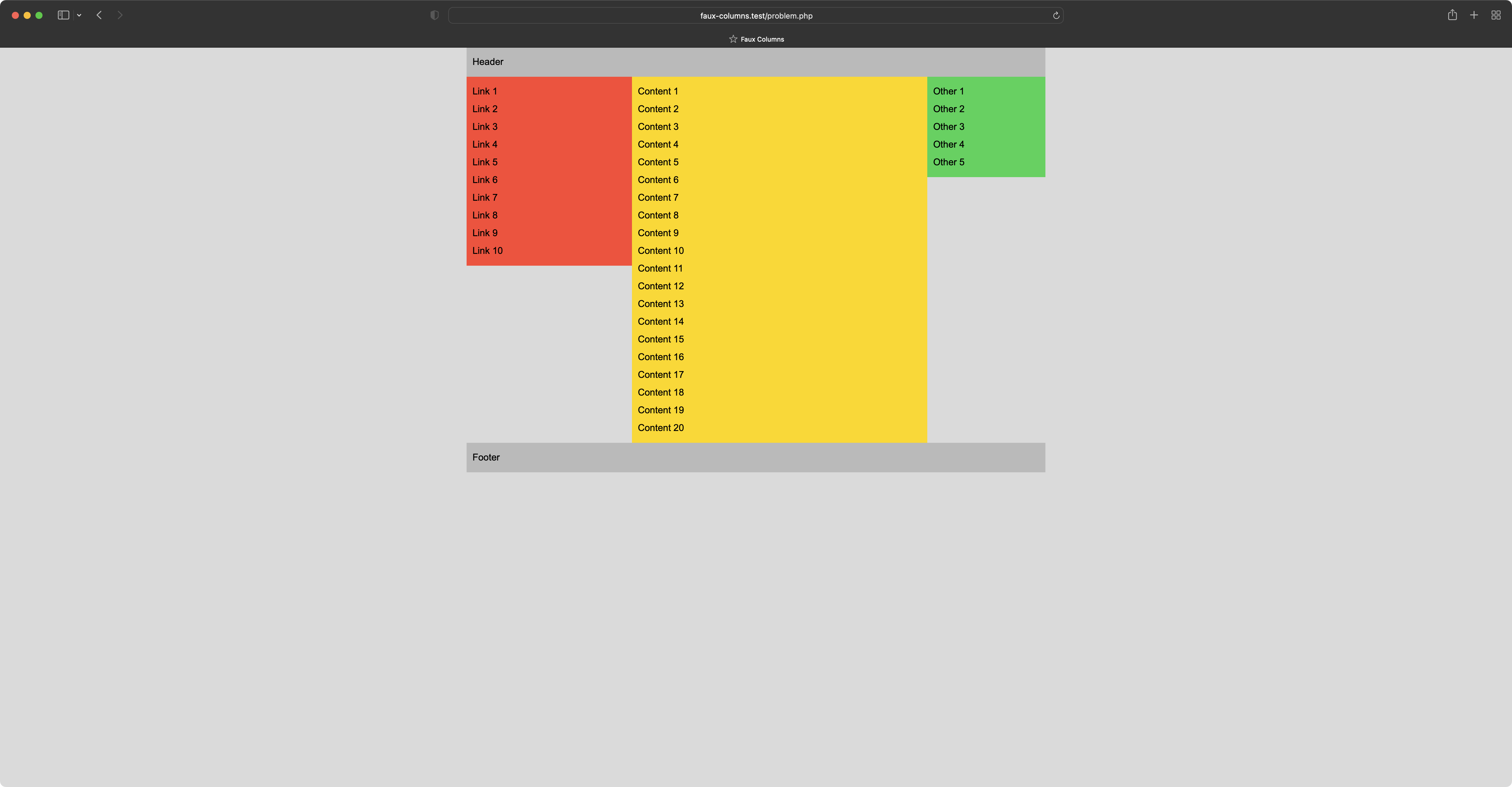
The following screenshot shows what we are talking about here. We have a typical centered (margin: 0 auto;) layout with fixed width of 980px. Left column is 280px, middle one is 500px and right one is 200px.
Source code representing the problem looks like:
<!DOCTYPE html>
<html lang="en">
<head>
    <title>Faux Columns</title>
    <style>
        body {
            background-color: #dadada;
            color: #000000;
            font-family: Arial, serif;
            margin: 0;
            padding: 0;
            line-height: 30px;
        }

        div {
            padding: 10px;
            box-sizing: border-box;
        }

        #wrapper {
            width: 980px;
            margin-left: auto;
            margin-right: auto;
            padding: 0;
        }

        #header {
            background-color: #bababa;
        }

        .column {
            float: left;
        }

        #left {
            background-color: #ff453a;
            width: 280px;
        }

        #middle {
            background-color: #ffd60a;
            width: 500px;
        }

        #right {
            background-color: #30d158;
            width: 200px;
        }

        #footer {
            background-color: #bababa;
            clear: both;
        }
    </style>
</head>
<body>
<div id="wrapper">
    <div id="header">
        Header
    </div>

    <div id="left" class="column">
        <?php foreach(range(1, 10) as $i) { ?> Link <?php echo $i; ?><br /> <?php } ?>
    </div>

    <div id="middle" class="column">
        <?php foreach(range(1, 20) as $i) { ?> Content <?php echo $i; ?><br /> <?php } ?>
    </div>

    <div id="right" class="column">
        <?php foreach(range(1, 5) as $i) { ?> Other <?php echo $i; ?><br /> <?php } ?>
    </div>

    <div id="footer">
        Footer
    </div>
</div>
</body>
</html>
Let's briefly go through the HTML structure. All visible elements (header, footer and three columns) are wrapped by the parent element called #wrapper. Wrapper's width is a sum of widths of all the columns. We give each column a shared class name (.column) which is responsible for positioning (float: left;). Finally we add clear: both; to the #footer to place it underneath.
The Solution
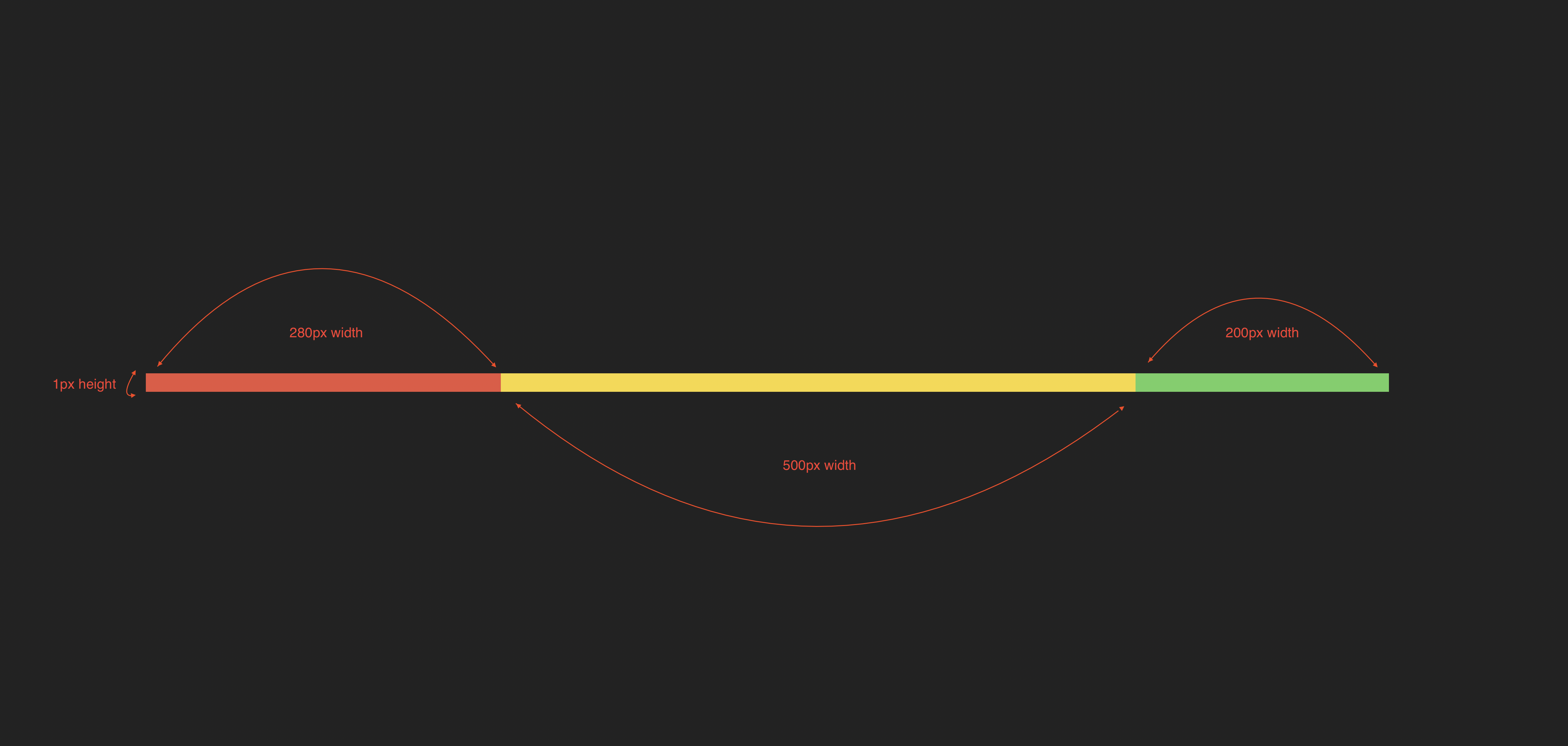
The way we approach the problem is quite interesting as we simply remove background-color property from #left, #middle and #right. Instead we are going to prepare a background image. We need a thin PNG slice which is going to be 980px wide and only 1px high.
Now going pixel by pixel from left to right:
- pixels from 1 to 280 should be coloured with
#ff453a - pixels from 281 to 780 should be coloured with
#ffd60a - pixels from 781 to 980 should be coloured with
#30d158
In other words, each range of pixels should match the colour of a column they are going to imitate and "imitate" is the key solution here as we apply this background image to the #wrapper (parent) element. The trick here is to use background-repeat: repeat-y; so that the slice is going to be repeated horizontally (Y-axis) to give an illusion of faux columns.
Now let's see styling for the #wrapper element:
#wrapper {
    width: 980px;
    margin-left: auto;
    margin-right: auto;
    padding: 0;
    background-image: url('faux_column.png');
    background-repeat: repeat-y;
    background-position: 50% 0;
}
The result is presented on the following screenshot:
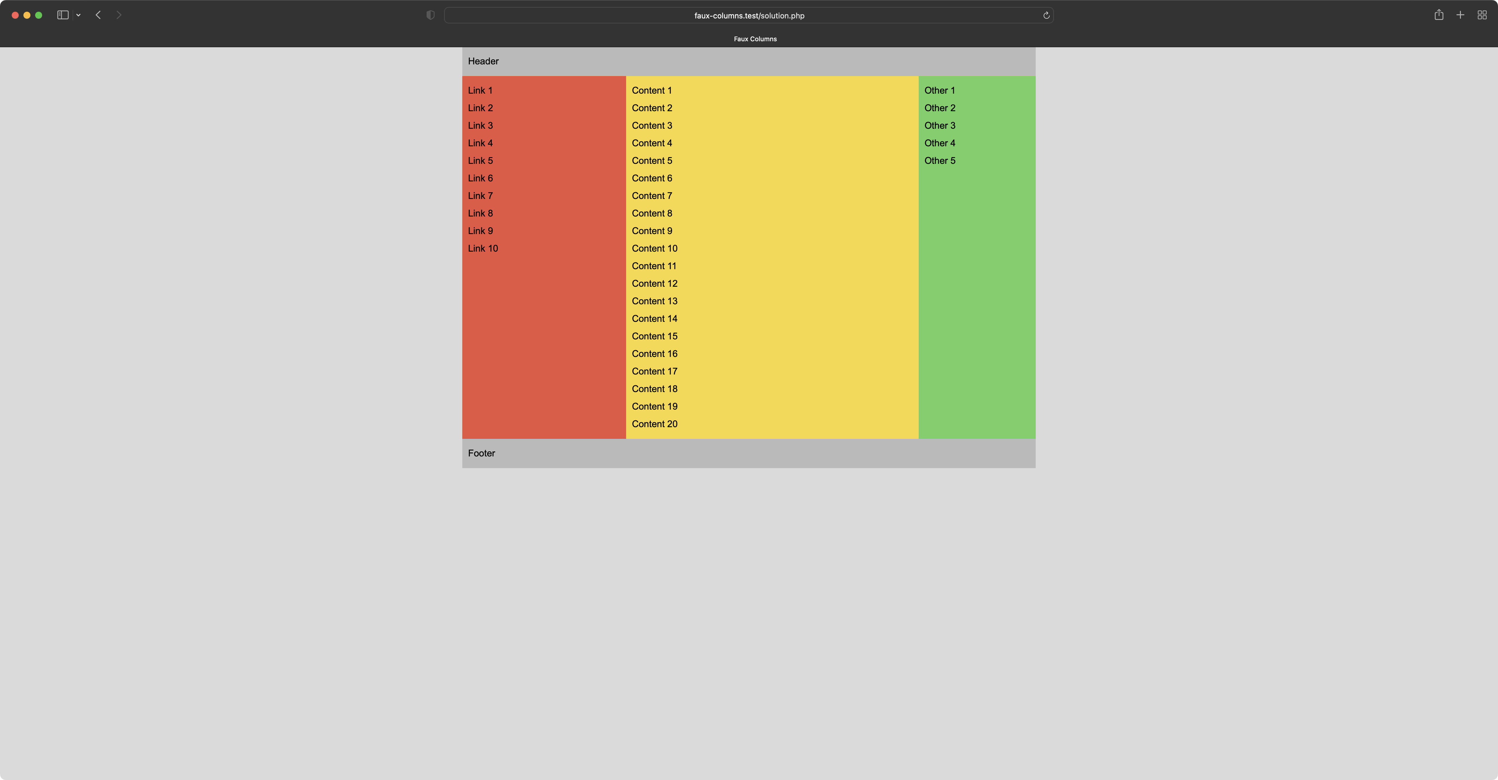
This is it. Optically all three columns have "equal height". This trick makes the entire layout more consistent and less incoherent. Keep in mind that this solution is suitable only when we deal with a fixed-width wrapper. I hope you find this solution creative anyway.
Side Note Revision
Originally I wrote this article in 2006. These days the Faux Columns solution may not look as impressive as it was back then. Today there are frameworks like Zurb Foundation or Twitter Bootstrap. Also developers are not prudent when it comes to use tons of JavaScript to solve bunch of issues like this one. Yet I still find the solution quite valuable.
As a small refresh of this content, new screenshots have been made as well as box-sizing: border-box; property has been added to the generic div element for easier width calculation (back then we could only dream about little goodies like this one in CSS).