
Regardless of how much content your website has, it is always good to keep your footer stick to the bottom of browser's window. Normally when there is not enough content, footer will position itself after the last element. Let me show you how to approach this problem with CSS only and always push your footer to the very bottom of a window.
What Is The Issue?
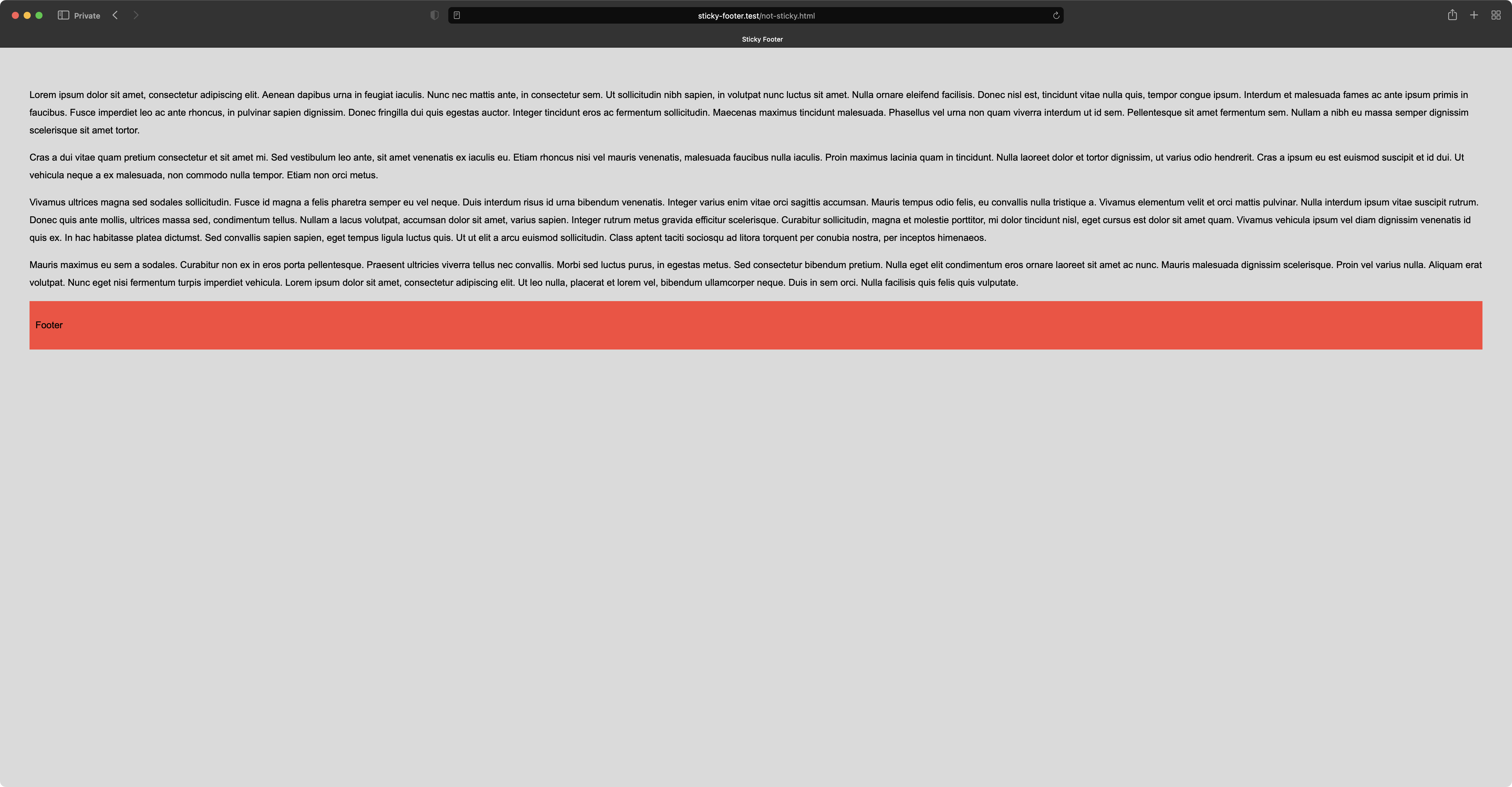
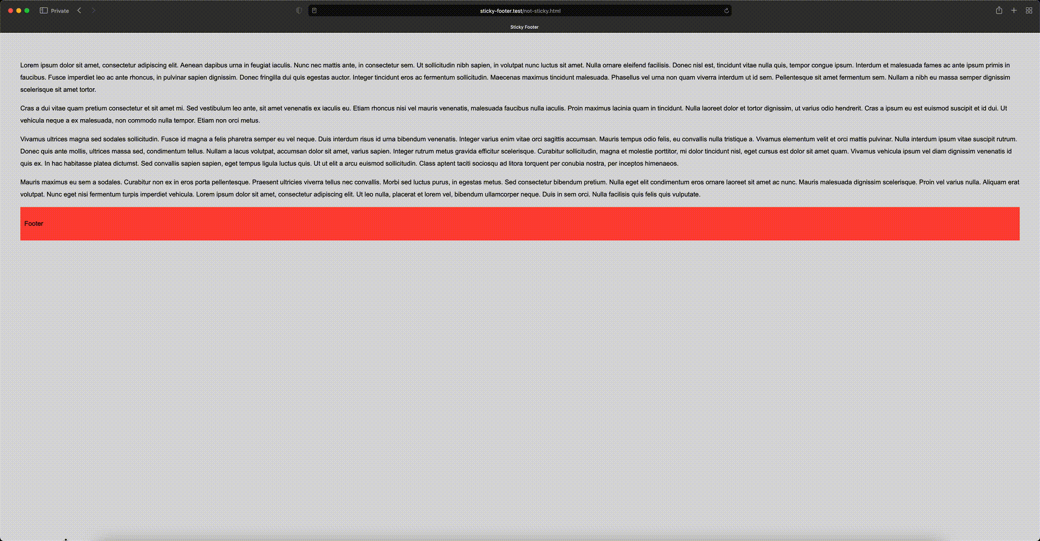
The problem usually occurs only when there's not enought content to fill up the entire browser window. In this case your footer (which is usually the last element before closing </body> tag), will stick to the top, straigth after the last element.
Take a look at the following example.
Below is the animation of the problem.
How To Fix This?
There is multitude of ways how to fix this. In this article I will focus only on the plain CSS ones. We won't need any JavaScript at all. The first way is rather old and requires more markup as well as styling (it has additional drawbacks I will talk about later), the second approach is modern, uses CSS Flexbox and requires less code than the first example.
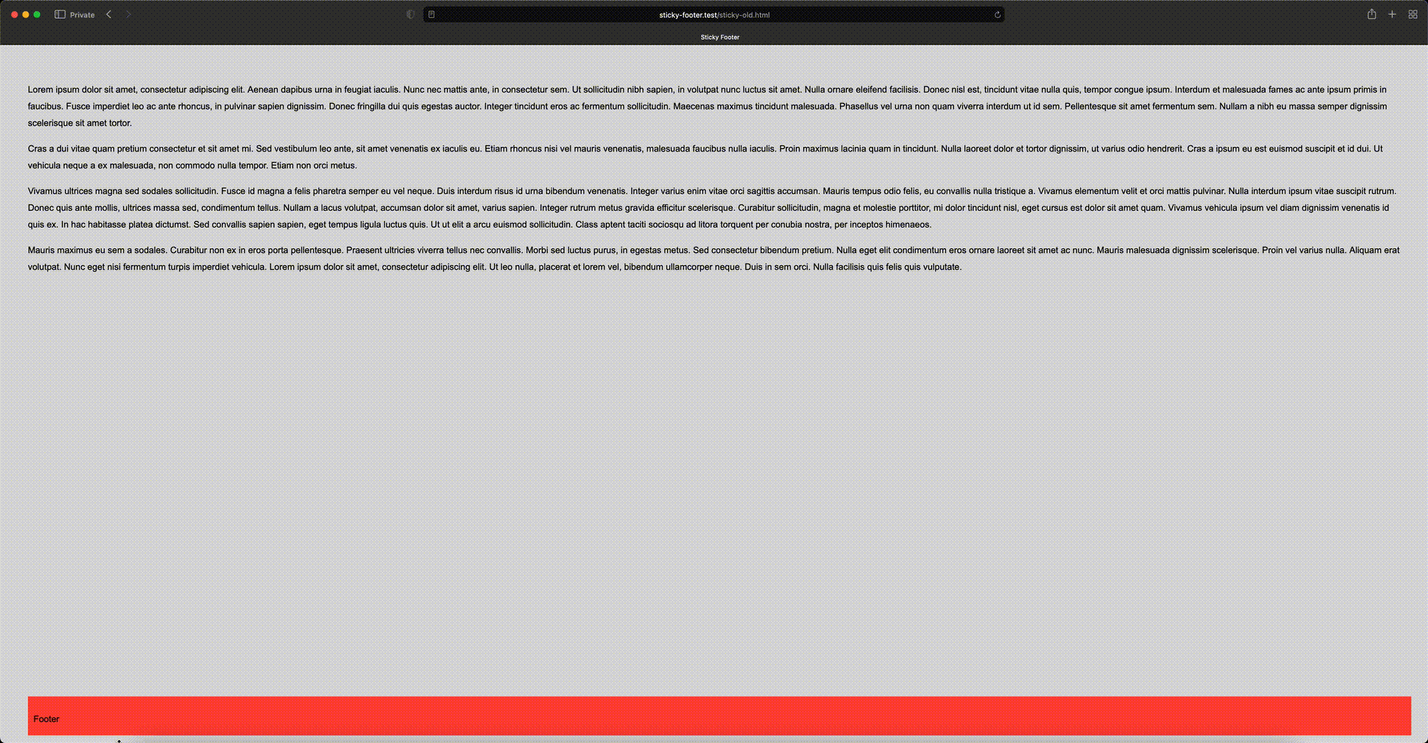
Non-flexbox Solution
This solution is was popular when browser support for Flexbox was low or none. Let's see both markup as well as the styles.
<!DOCTYPE html>
<html lang="en">

<head>
    <title>Sticky Footer</title>
    <style>
        html,
        body {
            height: calc(100% - 50px); /** subtract footer's height */
        }

        body {
            background-color: #dadada;
            color: #000000;
            font-family: Arial, serif;
            line-height: 30px;
            margin: 0;
            padding: 50px;
        }

        #wrap {
            height: auto;
            margin: 0 auto -50px; /** negative value, equal to footer's height */
            min-height: 100%;
            position: relative;
        }

        footer {
            background-color: #ff453a;
            bottom: 0;
            height: 50px;
            padding: 10px;
            position: relative;
            width: 100%;
        }

        .break {
            clear: both;
        }

        .push {
            height: 50px; /** same as footer's height */
        }
    </style>
</head>

<body>

<section id="wrap">
    <main>
        <p>
            Lorem ipsum dolor sit amet, consectetur adipiscing elit. Aenean dapibus urna in feugiat iaculis. Nunc nec mattis
            ante, in consectetur sem. Ut sollicitudin nibh sapien, in volutpat nunc luctus sit amet. Nulla ornare eleifend
            facilisis. Donec nisl est, tincidunt vitae nulla quis, tempor congue ipsum. Interdum et malesuada fames ac ante
            ipsum primis in faucibus. Fusce imperdiet leo ac ante rhoncus, in pulvinar sapien dignissim. Donec fringilla dui
            quis egestas auctor. Integer tincidunt eros ac fermentum sollicitudin. Maecenas maximus tincidunt malesuada.
            Phasellus vel urna non quam viverra interdum ut id sem. Pellentesque sit amet fermentum sem. Nullam a nibh eu
            massa semper dignissim scelerisque sit amet tortor.
        </p>

        <p>
            Cras a dui vitae quam pretium consectetur et sit amet mi. Sed vestibulum leo ante, sit amet venenatis ex iaculis
            eu. Etiam rhoncus nisi vel mauris venenatis, malesuada faucibus nulla iaculis. Proin maximus lacinia quam in
            tincidunt. Nulla laoreet dolor et tortor dignissim, ut varius odio hendrerit. Cras a ipsum eu est euismod
            suscipit et id dui. Ut vehicula neque a ex malesuada, non commodo nulla tempor. Etiam non orci metus.
        </p>

        <p>
            Vivamus ultrices magna sed sodales sollicitudin. Fusce id magna a felis pharetra semper eu vel neque. Duis
            interdum risus id urna bibendum venenatis. Integer varius enim vitae orci sagittis accumsan. Mauris tempus odio
            felis, eu convallis nulla tristique a. Vivamus elementum velit et orci mattis pulvinar. Nulla interdum ipsum
            vitae suscipit rutrum. Donec quis ante mollis, ultrices massa sed, condimentum tellus. Nullam a lacus volutpat,
            accumsan dolor sit amet, varius sapien. Integer rutrum metus gravida efficitur scelerisque. Curabitur
            sollicitudin, magna et molestie porttitor, mi dolor tincidunt nisl, eget cursus est dolor sit amet quam. Vivamus
            vehicula ipsum vel diam dignissim venenatis id quis ex. In hac habitasse platea dictumst. Sed convallis sapien
            sapien, eget tempus ligula luctus quis. Ut ut elit a arcu euismod sollicitudin. Class aptent taciti sociosqu ad
            litora torquent per conubia nostra, per inceptos himenaeos.
        </p>

        <p>
            Mauris maximus eu sem a sodales. Curabitur non ex in eros porta pellentesque. Praesent ultricies viverra tellus
            nec convallis. Morbi sed luctus purus, in egestas metus. Sed consectetur bibendum pretium. Nulla eget elit
            condimentum eros ornare laoreet sit amet ac nunc. Mauris malesuada dignissim scelerisque. Proin vel varius
            nulla. Aliquam erat volutpat. Nunc eget nisi fermentum turpis imperdiet vehicula. Lorem ipsum dolor sit amet,
            consectetur adipiscing elit. Ut leo nulla, placerat et lorem vel, bibendum ullamcorper neque. Duis in sem orci.
            Nulla facilisis quis felis quis vulputate.
        </p>
    </main>
    <section class="break push"></section>
</section>

<footer>
    <p>Footer</p>
</footer>
</body>
</html>
What can we see here?
- The footer element has a fixed height, which already gives us pretty serious limitation but also it (the value) has to be referenced in more than a single place within
styles. - We have additionanal makup with
<section class="break push"></section>that is responsible for push the footer to the very bottom of the window. - Both main content as well as "the push" element have to be additionally wrapped with a parent that has bottom margin equal to a negative value of footer's height. This is another complication and dependency.
- Finally the footer is defined outside of the wrapper and before closing
</body>.
This solution indeed works and does the job.
Flexbox Solution
Now let's take a look at solution that requires way less code.
<!DOCTYPE html>
<html lang="en">

<head>
    <title>Sticky Footer</title>
    <style>
        html, body {
            height: 100%;
        }

        body {
            background-color: #dadada;
            box-sizing: border-box; // purely for styling to compensate the 50px of padding
            color: #000000;
            display: flex;
            flex-direction: column;
            font-family: Arial, serif;
            line-height: 30px;
            margin: 0;
            padding: 50px; // purely for styling
        }

        main {
            flex: 1 0 auto;
        }

        footer {
            background-color: #ff453a;
            flex-shrink: 0;
            padding: 10px;
            width: 100%;
        }
    </style>
</head>

<body>

<main>
    <p>
        Lorem ipsum dolor sit amet, consectetur adipiscing elit. Aenean dapibus urna in feugiat iaculis. Nunc nec mattis
        ante, in consectetur sem. Ut sollicitudin nibh sapien, in volutpat nunc luctus sit amet. Nulla ornare eleifend
        facilisis. Donec nisl est, tincidunt vitae nulla quis, tempor congue ipsum. Interdum et malesuada fames ac ante
        ipsum primis in faucibus. Fusce imperdiet leo ac ante rhoncus, in pulvinar sapien dignissim. Donec fringilla dui
        quis egestas auctor. Integer tincidunt eros ac fermentum sollicitudin. Maecenas maximus tincidunt malesuada.
        Phasellus vel urna non quam viverra interdum ut id sem. Pellentesque sit amet fermentum sem. Nullam a nibh eu
        massa semper dignissim scelerisque sit amet tortor.
    </p>

    <p>
        Cras a dui vitae quam pretium consectetur et sit amet mi. Sed vestibulum leo ante, sit amet venenatis ex iaculis
        eu. Etiam rhoncus nisi vel mauris venenatis, malesuada faucibus nulla iaculis. Proin maximus lacinia quam in
        tincidunt. Nulla laoreet dolor et tortor dignissim, ut varius odio hendrerit. Cras a ipsum eu est euismod
        suscipit et id dui. Ut vehicula neque a ex malesuada, non commodo nulla tempor. Etiam non orci metus.
    </p>

    <p>
        Vivamus ultrices magna sed sodales sollicitudin. Fusce id magna a felis pharetra semper eu vel neque. Duis
        interdum risus id urna bibendum venenatis. Integer varius enim vitae orci sagittis accumsan. Mauris tempus odio
        felis, eu convallis nulla tristique a. Vivamus elementum velit et orci mattis pulvinar. Nulla interdum ipsum
        vitae suscipit rutrum. Donec quis ante mollis, ultrices massa sed, condimentum tellus. Nullam a lacus volutpat,
        accumsan dolor sit amet, varius sapien. Integer rutrum metus gravida efficitur scelerisque. Curabitur
        sollicitudin, magna et molestie porttitor, mi dolor tincidunt nisl, eget cursus est dolor sit amet quam. Vivamus
        vehicula ipsum vel diam dignissim venenatis id quis ex. In hac habitasse platea dictumst. Sed convallis sapien
        sapien, eget tempus ligula luctus quis. Ut ut elit a arcu euismod sollicitudin. Class aptent taciti sociosqu ad
        litora torquent per conubia nostra, per inceptos himenaeos.
    </p>

    <p>
        Mauris maximus eu sem a sodales. Curabitur non ex in eros porta pellentesque. Praesent ultricies viverra tellus
        nec convallis. Morbi sed luctus purus, in egestas metus. Sed consectetur bibendum pretium. Nulla eget elit
        condimentum eros ornare laoreet sit amet ac nunc. Mauris malesuada dignissim scelerisque. Proin vel varius
        nulla. Aliquam erat volutpat. Nunc eget nisi fermentum turpis imperdiet vehicula. Lorem ipsum dolor sit amet,
        consectetur adipiscing elit. Ut leo nulla, placerat et lorem vel, bibendum ullamcorper neque. Duis in sem orci.
        Nulla facilisis quis felis quis vulputate.
    </p>
</main>

<footer>
    <p>Footer</p>
</footer>
</body>
</html>
In this example we can observe:
- Either footer nor any other element has a fixed height defined.
- We do not have any additonal wrappers, pushers or elements that clear floating.
See it in action:
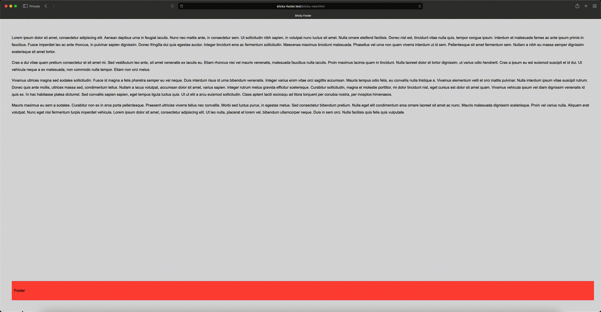
Pick a solution of your choice and give your website more pleasant appearance.